
The Five Core Cycles Driving Post-PC Mobile Smartphone Profits
What drove Apple's dramatic and unprecedented earnings performance from 2009 through 2012? What global macro-level wave enabled Apple equity performance to soar while once formidable smartphone competitors were caught off balance? Why did Apple's post-PC iPhone in particular capture the majority share of all mobile smartphone profits while virtually all non-post-PC smartphone competitors struggled for existence?
To answer these three key questions, we employ the Five Cycles Model from Cyclefund Research. Using this
unified macro-micro model, we examine the five core cycles that drove global product profitability of the Apple iPhone from 2007 through 2013, and we specifically identify 2010 as a critical
tipping-point year for Apple's post-PC vision relative to the prevailing vision of non-post-PC competitors, including Nokia, Research In Motion, and Microsoft.
The five core macro-level and micro-level cycles driving the dramatic and unprecedented adoption of the Apple iPhone from 2007 to 2013 were the following:
- Developing Middle Class Global Macro Cycle.
- Mobile Computing Global Technology Cycle.
- Smartphone Global Category Cycle.
- Apple iPhone Global Product Cycle.
- Post-PC Smartphone Global Profit Cycle.
Each of these 5 cycles or waves is examined and discussed in detail below. Moreover, since both macro-level and micro-level waves are inherently time-oriented,
multidimensional visual graphics are employed with clearly defined temporal dimensions to illustrate key points wherever possible.
Wave 1: The Developing Global Middle Class Macro Cycle
The first wave, defined as the global middle class cycle, is a macro-level cycle with long duration. As postulated by the Five Cycles Model, macro-level cycles tend to span multiple decades
in duration and our first cycle illustrated by the two population dynamics diagrams below is no exception.
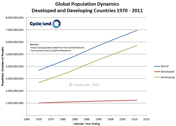
The diagram above entitled Global Population Dynamics in Developed and Developing Countries plots world population, developed country population, and developing country population versus time from 1970 through 2011. The key takeaway from the global population diagram is that current developing population levels are approximately 4.6 times that of developed population levels.
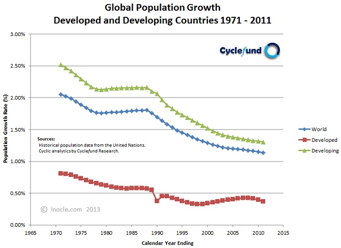
The diagram above entitled Global Population Growth Rates in Developed and Developing Countries plots annual world population growth, annual developed population growth, and annual developing population growth versus time from 1971 through 2011.
The key takeaways from the global population growth diagram are that current annual developing population growth, while down significantly over the last several decades, is still healthy at approximately 1.3 percent and current annual developed population growth is relatively stagnant at less than 0.4 percent.
Based on the key takeaway from the global population diagram two key takeaways from the global growth diagram, we can infer that the middle-class population of the future shall rise from developing rather than developed countries. And it is precisely this new rising middle class population where we expect to see the next major smart war between traditional PC companies and modern post-PC companies, as they battle for global share of across all smart device categories from wearable mobile smart devices (such as internet bands, watches, and glasses) and non-wearable mobile smart devices (such as players, phones, tablets, and laptops) to embedded mobile smart devices (such as automobile electronics and non-humanoid and humanoid robotics), embedded non-mobile smart devices (such as home appliances and business kiosks), and non-mobile smart devices (such as desktops, set-top boxes, game consoles, high definition televisions, and extreme definition TVs).
The list of developed countries used in the construction of the global population and global population growth diagrams above and in the construction of the mobile subscription and mobile subscription growth diagrams below includes: Albania, Andorra, Australia, Austria, Belarus, Belgium, Bermuda, Bosnia and Herzegovina, Bulgaria, Canada, Croatia, Czech Republic, Denmark, Estonia, Finland, France, Germany, Greece, Greenland, Hungary, Iceland, Ireland, Italy, Japan, Latvia, Liechtenstein, Lithuania, Luxembourg, Malta, Monaco, Montenegro, Netherlands, New Zealand, Norway, Poland, Portugal, Romania, Russian Federation, San Marino, Serbia, Slovakia, Slovenia, Spain, Sweden, Switzerland, the former Yugoslav Republic of Macedonia, Ukraine, United Kingdom of Great Britain and Northern Ireland, and the United States
.
Population values from 1970 through 2011 are sourced from the United Nations Statistics Divisions National Accounts Main Aggregates Database. Population growth rates from 1971 through 2011 are computed values.
Wave 2: Mobile Cellular Computing Technology Cycle
The second wave, defined as the global mobile technology cycle, is also macro-level cycle with long duration. As postulated by the Five Cycles Model, macro-level technology cycles tend to
span several decades in duration and our second cycle illustrated by the two mobile subscription dynamics diagrams below is also no exception.
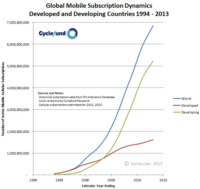
The diagram above entitled Global Mobile Subscription Dynamics in Developed and Developing Countries plots world mobile cellular subscriptions, developed country mobile cellular subscriptions, and developing country mobile cellular subscriptions versus time from 1994 through 2013. The key takeaway from the mobile subscription diagram is that current developing mobile subscription levels are 3.2 times that of developed mobile subscription levels.
The diagram below plots annual world mobile cellular subscription growth, annual developed country mobile cellular subscription growth, and annual developing country mobile cellular subscription growth versus time from 1995 through 2013. Note that subscriptions from 1994 through 2012 are sourced from the International Telecommunication Union (ITU) World Telecommunication/ICT Indicators Database, subscription growth rates from 1995 through 2012 are computed values, and subscriptions and subscription growth rates for 2013 are estimated values.
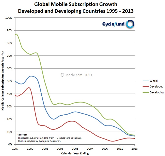
The diagram above entitled Global Mobile Subscription Growth Rates in Developed and Developing Countries plots annual world mobile cellular subscription growth, annual developed country mobile cellular subscription growth, and annual developing country mobile cellular subscription growth versus time from 1995 through 2013. The key takeaways from the mobile subscription growth diagram are that current annual developing mobile subscription growth, while down dramatically over the past two decades, is still strong at 7.3 percent and current annual developed mobile subscription growth is healthy with at 4.8 percent.
Mobile subscriptions from 1994 through 2012 are sourced from the International Telecommunication Union (ITU) World Telecommunication/ICT Indicators Database. Mobile subscription growth rates from 1995 through 2012 are computed values. Mobile subscriptions and subscription growth rates for 2013 are estimated values.
Wave 3: Smartphone vs. Feature Phone Category Cycle
The third and perhaps most important wave from a competitive strategy viewpoint is defined as the global smartphone category cycle, a semi-macro level cycle with medium duration. As
postulated by the Five Cycles Model, semi-macro level category cycles tend to span roughly a decade in duration and our third cycle illustrated by the installed base dynamics diagram below is no
exception.

The diagram above is formally referred to as the Strategic Games Model (SGM) of Intergame Competition for Mobile Devices in Developed and Developing
Countries. It plots the global installed base of smartphone devices versus the global installed base of feature phone devices for both developed (red line) and developing (green line) countries
over time. The distinctive term intergame competition in the title of the diagram is employed specifically to denote pairwise competition between firms or business units providing unique
approaches for delivering superior value to customers. The most senior approach is defined as the old game and the more nascent approach is defined as the new game.
Intergame Competition between Mobile Smartphones and Feature Phones
As defined above, intergame competition describes pairwise competition between a firm, or group of firms, committed to an old game approach versus a competing firm, or competing group of firms,
committed to a new game approach. For example, in the diagram above, the new game is the mobile smartphone game and the old game is the feature phone game.
Intergame competition between old and new games can also be split and analyzed across specific market segments. For example, the diagram above contains two very important market segments:
a) the developed country market segment and b) the developing country market segment. Each of these market segments are represented by unique time varying installed
base trajectories.
The intergame competition between the old and new games within the developed country market segment from 2005 through 20013 is depicted by the red line in the diagram above. Specifically,
the red-line trajectory represents the global installed base of smartphones (new game) relative to feature phones (old game) in developed countries from 2005 through 2013, with dotted red-line
projections beyond 2013.
The intergame competition between the old and new games within the developing country market segment from 2005 through 20013 is depicted by the green line in the diagram above. Specifically,
the green-line trajectory represents the global installed based of smartphones (new game) relative to feature phones (old game) in developing countries from 2005 through 2013, with dotted green-line
projections beyond 2013.
The red-line trajectory in the diagram indicates that the global installed base of features phones in developed countries reached saturation between 2006 and 2007, has been subject to accelerating
declines through 2013, and is expected to continue to experience declines into the future. Similarly, the green-line trajectory indicates that the global installed base of features phones in
developing countries reached saturation between 2012 and 2013 and is expected to experience accelerating declines beyond 2013, as experienced previously in developed countries.
Given the analysis of the red-line and green-line trajectories above, it is patently evident that one of the largest and most important strategic games of all time is rapidly unfolding today
as massively populous developing countries around the world increasingly accelerate their adoption of smartphones (new game) relative to feature phones (old game) at the astonishing rates previously
experienced by far less populous developed countries. In summary, intergame competition between the old game (non-post-PC feature phones) and the new game (post-PC smartphones) is just getting
started in developing markets (green line), and we strongly expect it to follow the same explosive pattern that we have witnessed in developed markets (red line).
Strategic Games Installed Base X-Pattern Diagram for Mobile Devices
Before we discuss the fourth cycle, it is important that we present the alternative form of the graphical representation of the Strategic Games Model of Intergame Competition for Mobile Devices
described in the previous section. As shown in the diagram below, the alternative form is time-explicit, rather than time-implicit like its primary form, and it is particularly
useful for analyzing tipping point patterns that occur in strategic intergame competition over relatively short windows in time.
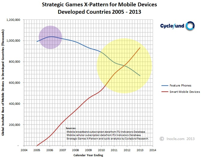
We call the diagram above the Strategic Games Model X-Pattern Diagram for Mobile Phone Categories in Developed Countries. It plots the global installed base
of feature phones in developed countries and the global installed base of smart mobile devices in developed countries versus time from 2005 to 2013.
More specifically, the X-pattern diagram above represents the strategic intergame competition between feature phones (old game) and smart mobile devices (new game) from 2005 to 2013 and highlights
two distinct and important tipping point patterns. The first tipping point pattern, highlighted by the small purple sphere in the X-pattern diagram above, occurs in 2006 and represents the
saturation point of feature phones in developed countries.
The second tipping point pattern, highlighted by the large yellow sphere in the diagram, occurs between 2010 and 2013 and represents the accelerated mass-market crossover point from feature
phones to smart mobile devices in developed countries and provides irrefutable evidence that people living in developed countries are clearly unwilling to settle for feature phones and have been
increasingly demanding smartphones instead, as visually illustrated by the red and blue lines crossing and forming a distinct X-pattern within the yellow sphere above.
Wave 4: Apple Post-PC iPhone vs. Nokia non-Post-PC Phone Product Cycle
The fourth wave is defined as the global iPhone product cycle, a micro-level cycle with relatively short duration. As postulated by the Five Cycles Model, micro-level product cycles tend to
span several years in duration and the fourth cycle illustrated by the competitive X-pattern diagram below is no exception.

We refer to the diagram above as the Strategic Games Model X-Pattern Diagram for Nokia vs. Apple Installed Base of Products. It plots the estimated global
installed base of Nokia phones (both Nokia feature phones and Nokia non-post-PC smartphones) vs. the estimated global installed base of Apple iPhone post-PC smartphones versus time from 2005 through
2013.
X-pattern diagrams are also referred to as moon-and-the-sun diagrams, with the emergence of a purple moon signifying and presaging a lagged emergence of a yellow sun, or more ominously the
formation of a definitive X-pattern, wherein an old game is destructively shattered by a new game within a very short window in time, typically catching many unsuspecting and often incredulous CEOs,
shareholders, and investors off guard.
Intergame Competition between Nokia and Apple
The X-pattern diagram above represents the strategic intergame competition between Nokia non-post-PC phones (old game) and and Apple post-PC phones (new game) from 2005 to 2013 and highlights two
distinct and important tipping point patterns. The first tipping point pattern, highlighted by the purple sphere in the X-pattern diagram, occurs approximately in 2010 and represents the saturation
point of Nokia non-post-PC phones globally.
The second tipping point pattern, highlighted by the yellow hemisphere in the diagram, begins in 2012 and represents the accelerated mass-market shift from Nokia non-post-PC phones to Apple post-PC
phones (as well as post-PC phones from other emerging post-PC smartphone vendors, such as Samsung) and provides convincing evidence that people around the world are clearly unwilling to settle for
non-post-PC feature phones and non-post-PC smartphones and have been increasingly demanding post-PC smartphones instead, as visually illustrated by the green and purple lines converging and beginning
to form an X-pattern within the yellow hemisphere above.
Wave 5: Apple Post-PC Profit Cycle vs. Nokia non-Post-PC Profit Cycle
The fifth wave is defined as the global post-PC smartphone profit cycle, a micro-level cycle with short duration. As postulated by the Five Cycles Model, micro-level profit cycles tend to
span several quarters in duration and the fifth cycle illustrated by the quarterly operating profit diagram for Nokia below is no exception.
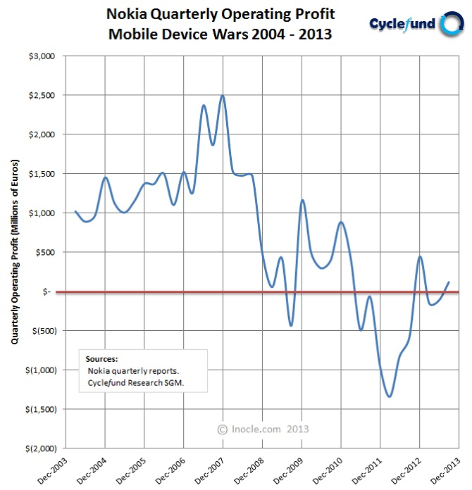
As seen in the diagram above, operating profits may vary significantly across quarters and dramatically across several quarters; profits may trend upward over
quarters and years; profits may trend downward over quarters and years; profits may be adversely affected by national or global recessions or positively affected by strong seasonal patterns, such as
national or global holidays; and profits may be positive, negative, or zero for a given quarter or even across many quarters.
Given the volatility of profits across quarters, we must aggregate quarterly results over a longer time period in order to be useful in competitive analysis and trend identification. In the context
of our analysis of global smartphone wars, our preferred aggregation period for profit cycles is one year. When we do so for both Nokia and Apple, we arrive at the following profit diagram
below.
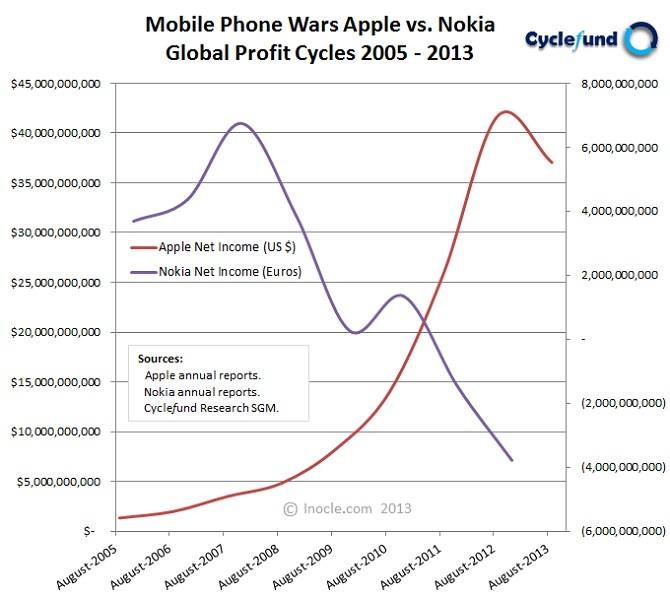
We refer to the diagram above as the Strategic Games Model X-Pattern Diagram for Apple vs. Nokia Profit Performance. It plots the annual net income for Apple from fiscal year ending 2005 to fiscal year ending 2013 in US dollars and the annual net income for Nokia from fiscal year ending 2005 to fiscal year ending 2012 in euros. The diagram clearly depicts an X-pattern in global smartphone profits, with Apple's new-game post-PC smartphone profit trajectory rising geometrically and Nokia's old-game non-post-PC smartphone and mobile feature phone profit trajectory falling precipitously.
Strategic Games Equity Performance X-Pattern Diagram for Mobile Devices
In general, corporate profit trajectories within SGM global profit cycle diagrams are typically closely correlated with corporate equity performance trajectories. More specifically, when intergame competition between two firms results in an X-pattern in global profits (with profits generated by the firm offering customers a new-game solution rising and profits generated by the competing firm offering customers an old-game solution falling) a corresponding X-pattern in equity price performance typically arises, as shown in the diagram between new-game (post-PC smartphone) firm Apple and old-game (non-post-PC smartphone) firm Nokia.

We refer to the diagram above as the Strategic Games Model X-Pattern Diagram for Apple vs. Nokia Stock Performance. It plots the daily stock price for Apple from calendar year ending 2005 to calendar year ending 2012 in US dollars and the daily stock price for Nokia from calendar year ending 2005 to calendar year ending 2012 in US dollars. The diagram clearly depicts an X-pattern in equity price performance, with Apple's new-game post-PC smartphone stock price trajectory rising exponentially and Nokia's old-game non-post-PC smartphone and mobile feature stock price trajectory falling hyperbolically.
The Catastrophic Collapse of non-Post-PC Smartphone Leader Nokia
The global profit cycle diagram above dramatically depicts the catastrophic effects of the two prior cycles, the category cycle and the product cycle, on Nokia's annual net income. First, as
illustrated by the category cycle diagram entitled SGM X-Pattern Diagram for Mobile Devices presented previously, feature phones reached a saturation point in developed countries in 2006 (as
highlighted by the center of the small purple sphere) and mobile smartphones reached an acceleration point in developed countries in 2009 (as highlighted by the left edge of the large yellow sphere).
Both of these factors associated with the category cycle, as well as the onset of a the great global economic recession of 2008, led to Nokia's annual profits peaking in late 2007 and declining
precipitously into late 2009.
Second, as illustrated by the product cycle diagram entitled SGM X-Pattern Diagram for Nokia vs. Apple presented previously, Nokia's feature phones and non-post-PC smartphone reached a saturation
point globally in the middle of 2010 (as highlighted by the center of the purple sphere) and Apple's post-PC smartphones reached an acceleration point globally in late 2011 (as highlighted by the
left edge of the yellow sphere). Both of these factors, as well as increasing success of emerging Android-based post-PC competitors, led to Nokia's annual profits
achieving a local peak in late 2010 and then continuing to decline catastrophically into 2012.
In late 2013, after a catastrophic loss in the market value of its business (as clearly depicted in the SGM equity performance X-pattern diagram above) Nokia agreed
to sell its mobile handset business to Microsoft for just over seven billion dollars.
The Parabolic Rise of Post-PC Smartphone Leader Apple
The global profit cycle diagram also dramatically depicts the positive effects of the two prior cycles (the category and product cycles) on Apple's annual net income. First, the category cycle
diagram shows mobile smartphone adoption accelerating in developed countries in 2009. Second, the product cycle diagram shows non-post-PC smartphones and feature phones from Nokia, the mobile phone
market leader at the time, saturating in 2010 and post-PC smartphones from Apple, the post-PC mobile phone market leader at the time, accelerating strongly in 2011.
All three of these factors, as well the limited competition from emerging Android-based post-PC competitors such as Samsung, Motorola, and Google led to Apple's
annual profits soaring parabolically from 2008 to 2012 and a corresponding surge in the market value of its business (as clearly depicted in the SGM equity performance X-pattern diagram above).
Post-PC Waves: The Indisputable Rise of the Post-PC Era
With the first application of the Five Cycles Model to the Apple iPhone now complete, we are in a unique and fortunate position to create a powerful visual summary of our cyclic wave analysis by
combining the following four two-dimensional diagrams into a single unified view:
- The Strategic Games Model X-Pattern Diagram for Feature vs. Smart Phone Categories
- The Strategic Games Model X-Pattern Diagram for Nokia vs. Apple Products
- The Strategic Games Model X-Pattern Diagram for Nokia vs. Apple Profits
- The Strategic Games Model X-Pattern Diagram for Nokia vs. Apple Stock
The resulting three-dimensional composite diagram representing the indisputable arrival of today's modern post-PC era consists of a stack of post-PC X-pattern wave diagrams is shown below for the first time.
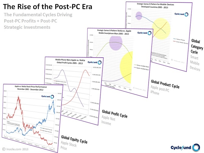
We call the diagram above Post-PC Waves: The Indisputable Rise of the Post-PC Era. It is structured in three dimensions and contains a total of eight temporal or time-varying trajectories organized into vertical four-layer stack with two temporal X-pattern trajectories within each layer. The first layer (furthest back), second layer, and third layer represent the global post-PC category cycle X-pattern wave, global post-PC product cycle X-pattern wave, and global post-PC profit cycle X-pattern wave of the Five Cycles Model, respectively. The fourth layer (furthest forward) represents the global post-PC equity cycle X-pattern wave, which is highly correlated with the global post-PC profit cycle X-pattern wave of the Five Cycles Model assuming a well behaved or non-GLE (non-global-liquidation-event) global macro cycle.
The rise of the post-PC era diagram traces the evolution through time of the world's first post-PC company (Apple) and its leading post-PC product (the Apple iPhone) from multiple post-PC perspectives (category wave view, product wave view, profit wave view, and equity wave view) over multiple time periods (2005 - 2013). More specifically, individual post-PC perspectives include a technology category X-pattern wave (mobile post-PC smartphone and non-post-PC smartphone subscribers vs. mobile feature phone subscribers over time), a product installed base X-pattern wave (Apple iPhone post-PC mobile smartphone installed base vs. Nokia non-post-PC mobile smartphone and feature phone installed base over time), a profit performance X-pattern wave (Apple net income vs. Nokia net income over time), and an equity performance X-pattern wave (Apple AAPL stock price vs. Nokia NOK stock price over time) all captured in a single unified multidimensional visual diagram illustrating the immensely powerful post-PC waves driving the dramatic and indisputable rise of the post-PC era within a relatively narrow window in time.
The AI Cloud Wave for 2020 and Beyond
With emerging markets and developed markets expected to achieve annual long-term growth rates of approximately 5% and 2% on a real basis respectively, an annual long-term global growth rate of approximately 3% on a real basis should represent a reasonable assumption for investment purposes, which is consistent with an expected annual long-term global population growth rate of approximately 1% or less plus an annual long-term global productivity growth rate of approximately 2%.
With the advent and widespread adoption of Artificial Intelligence (AI) technologies across many global industries and markets, we expect significant upside potential for annual long-term global productivity growth rates, perhaps on the order of an additional 1% to 2% or more. Should global AI adoption drive this rate into the 2% range, an annual long-term global growth rate of approximately 5% on a real basis is not out of the realm of possibility. However, at this level of global growth, fiscal and monetary policies would need to be carefully reevaluated in order to avoid runaway inflationary forces or overly burdensome global interest rates.
Ideally, if global growth rates were to accelerate due to widespread adoption of AI technologies, we would expect global interest rates to adjust accordingly via economic, market, and central bank forces. For example, should annual long-term global growth rates achieve a level of 4% to 5% on a real basis through AI productivity gains, then in the long term we would expect annual global interest rates to exceed their historical levels, perhaps rising to 3% to 4% or more on a real basis in the middle of the yield curve.
Given this outlook, what might cause an upside surprise for global equity markets in the medium to long term? The short answer is accelerating global AI adoption!
More specifically, there may be significant upside potential for global equity markets should widespread adoption of AI technologies spur annual long-term global growth rates on a real basis well above 3%. In such an environment, we would expect the stocks of U.S. companies that supply, or uniquely apply, these AI technologies to significantly outperform the current expectations of market participants.
Moreover, we would also expect the stocks of AI-focused foreign companies, including those companies based in emerging economies such as China and India, to markedly outperform the current expectations of market participants.
Since this outlook anticipates upside potential for AI-focused U.S. and non-U.S. equities in the medium to long term, what companies are likely to benefit most from these trends over the next five or more years? The answer to this question best summarized by the Cyclefund AI Cloud Technology Portfolio 2020 – 2025, which contains seventeen strategic investment themes with one or more strategic companies for each theme. Two diagrams for visualizing this portfolio are included herein for reference.
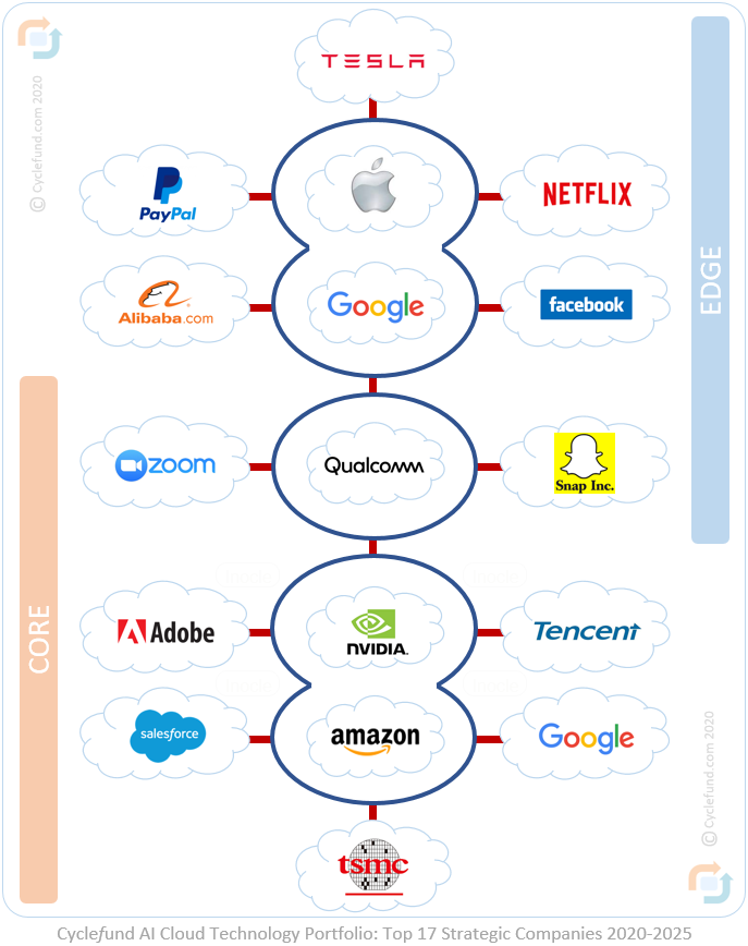
The first is entitled the Cyclefund AI Cloud Technology Portfolio: Top 17 Strategic Companies 2020 – 2025 and is presented above.
Strategic companies that are included as strategic holdings in this diagram or under consideration for inclusion as strategic candidate holdings in this diagram comprise publicly traded equities from the following list of one hundred and twenty-one (121) stocks from Cyclefund Research:
Note: The Cyclefund AI Cloud Technology Portfolio 2020 – 2025 is an extension of the Cyclefund Ultra Speculative Technology Portfolio 2014, which itself is a derivative of the Cyclefund Core, Aggressive, and Speculative Technology Portfolios 2013.
These portfolios may be openly accessed from the Cyclefund Research website (cyclefund.com) or mobile site (sites.google.com\view\cyclefund). However, the Cyclefund Research mobile site is primarily focused on the Cyclefund Tesla Case Study of 2016.
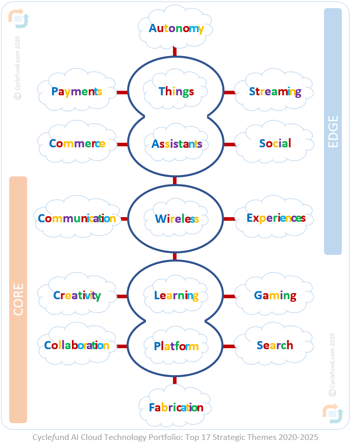
The second is entitled the Cyclefund AI Cloud Technology Portfolio: Top 17 Strategic Themes 2020 – 2025 and is also presented above.
Strategic themes that are included in this diagram or candidate themes under consideration for inclusion in this diagram are drawn from the following pool of forty-three (43) investment themes from Cyclefund Research:
Logo tumbnails utilized in or considered for the diagrams above are included for reference below in alphabetical order from top left to lower right.


Please note that many of the strategic companies included in the Cyclefund AI Cloud Technology Portfolio 2020 – 2025 may be significantly overvalued at the time of this writing in late 2020.
It is to be understood that the content presented herein is for informational purposes only and does not constitute financial advice. One should always consult with his
or her financial advisor or fiduciary financial advisor during the process of making financial decisions and well in advance of committing capital to financial investments.
About Cyclefund
Cyclefund.com is a privately sponsored financial literacy and educational resource openly available on the web and accessible via the internet at no charge to
pre-retired and retired investors around the world who seek to directly manage their personal or family wealth.
Cyclefund was founded by Dr. Mark Cummings in 2010
based on a unified financial model specifically designed to help self-directed investors identify strategic investment themes with long time horizons and disruptive growth potential.